
Contrast in texture
In this photo I found a red snakeskin wallet and looked for wood, in this photo I used a brown oak table. I tried to center the line between them as well as possible, and then edited it to be more vertical in Lightroom. I used two split tones on the photo so that I could edit the snakeskin and make it more vibrant without it changing the entire photo, and then I used another to make the wood darker to give the photo a more intense contrast.

Contrast in color
I used this photo because even without editing the contrast in color is clear. The purple versus the light green shows a strong change. I edited the photo by first cropping it a lot, so that the main focus of the image would be the cabbage. I left the radishes on the left so that the two colors of it would show a connection with the cabbages.

Contrast in color/texture
In this photo I used some vegetables that I found at a market. I turned up the vibrancy of the greens purples, yellows, and blues. I used the blue background to really show color difference, and then between the color of the vegetables. It is also a contrast in texture, showing change between the texture of the smooth cloth blue underneath the vegetables, and then then between the onions and the cucumber.

Depth of Field
I used a close up of these baby eggplants to show depth of field in the photo. I cropped in to show the focus on the vegetables. I turned up the saturation of the greens, purples and blues to make the photo more vibrant and interesting. The clarity at the ends of the eggplants and the foggy, vague, out of focus watermelons and background of the photo make a clear depth of field photo.

Movement
In this diptych I show two different kinds of movement. I changed my camera settings to get my friend spinning with the still background, which makes her look blurred, and in the other I changed my settings in manual mode to get all of the movement in one shot, so her moving hair and body in still in focus. I decided to edit the photos after I had made it a diptych to be sure to connect them color wise.

Movement
This is my second diptych showing movement, blurry and then clear. I put a darker split tone on it to make it look more moody and interesting. I had my aperture really low so that I could have my sister's body come out really blurry, which looks really cool with the Christmas lights. I put the settings back on normal to get the lights in focus.

Contrast in scale
I used this photo to show a contrast in scale by taking a below shot of one of the giant chess pieces downtown. I decided to take it from below to show a more intense contrast in scale. The chess piece looks much smaller than the buildings. I turned up the saturation of the sky, to make it more blue, and I turned down some of the white highlights on the chess piece to make it look more stark against the blue sky.
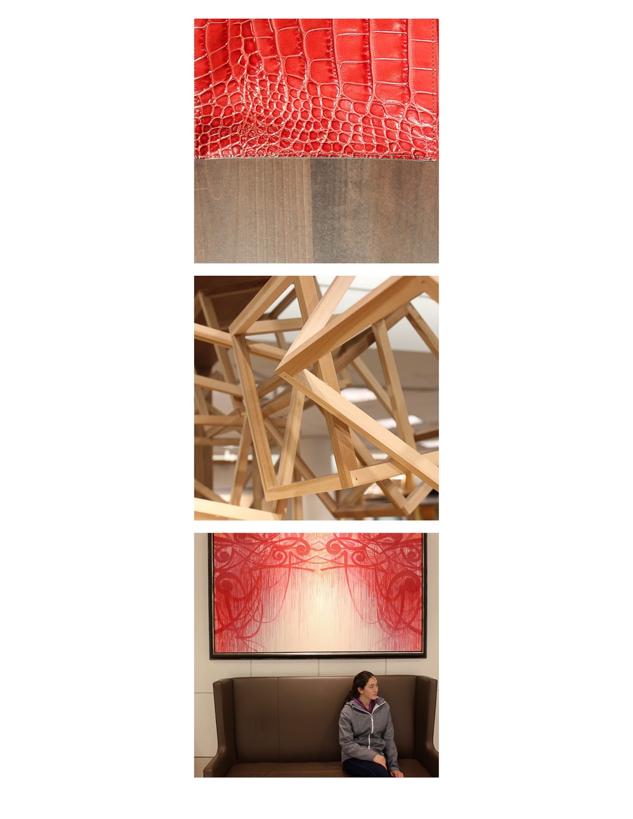
Triptych
In this triptych I decided to play upon the colors of light brown, dark brown, and red. In the first photo I thought my snake skin photo worked the best, and then I used a photo of wooden three dimensional cubes in between to separate and unite the photos. I toned down the photos after I had put them into triptych form, to make the red look a little more connected with the whites.


No comments:
Post a Comment