Tuesday, October 27, 2015

Project 2: Color and Grids!


I think the photographer used color to give this photo a warm, nice mood. Using warm colors, the effect of heat and comfort emanates from the photograph. I think they used a split tone to saturate the oranges in the photo.

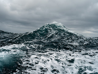
 Corey Arnold
Using cool colors and a dark filter, the photo creates a cold and icy feel. The dark blue of the water makes it look freezing and uninviting. It makes me feel nervous being out in the open sea. I think the photographer turned up the green saturation in this photo, and turned down the saturation in the sky.

Michael Kenna
The use of black and white makes the photo feel moody and barren, it looks like a place you wouldn't want to hang out at. I can tell there is really good technique in this photo to make it seem that way, because this is a photo of the Sydney Opera House. The Sydney Opera House has always been made to look exciting and welcoming, but the photographer managed to make it look like a dead zone! 

Wednesday, October 14, 2015

Project 1: Framing and Composition!

Our very first project in our photography class was a success! We were working on the technique of deliberately manipulating the framing and composition within our work, and how editing can affect it! We had two walking field trips to Downtown Portland in the Pearl district, the first to the area around Pioneer Place and the other to the area around the Portland Farmer's Market. We were given pretty much free range to take photos where ever our creativity lead us, which for me resulted in beautiful and satisfactory photos. Taking pictures and checking how they look and how you can change them is really to me what helped me learn the most the fastest!


Rule of Thirds

I shot this photo from the second story inside Pioneer Place. When we were instructed to make our photography techniques as obvious as possible in our photos, my first thought was verticals! I chose this one as my final rule of thirds photo because while it clearly depicts the technique, it also is interesting because of the change in depth field. The symbols in the image also speak to me because I think it shows something deeper: the multiple cultures found within the US! As a former exchange student, acceptance and the mixing of cultures is something that is important to me. In this photo there is the street sign of an Italian restaurant called Pasitini, and in the background the American flag. This shows to me a blending of the Italian culture in the "American" culture! I decided to give this photo a more "old times" feel by turning up the grain within the photo, and turning down the whites and the highlights to make it more dim. I put a vignette on the photo to further the dark shadow, and cropped the sides of the photo to make it fit perfectly within the thirds of the frame.

Frame Within a Frame

This is by far my favorite frame within a frame of mine! While it is clearly showing the technique, it also is to me a beautiful photo. It has color and depth, and the fact that you are looking straight up and see the buildings reflecting in the sunlight is super pretty to me. This photo is made ten times more interesting with the framing created by the glass roof, which I think makes this photo the perfect example of frame within a frame! I took this when I was just leaving the Pioneer Place Mall, and this glass roof was just outside the front doors. To edit this photo, I changed the saturation of some of the colors in the photo, and I played upon the already present hues of blue and purple within the photo. I turned up those two colors, and to make the framing within the photo as clear as I wanted them to be, I tilted the photo so that the lines were straight up and down.


Close Up

I found this gorgeous flower wandering through the Portland Farmer's Market in Downtown Portland. I took this photo from above the flower, and I just love the colors in this one! Because I really like the colors, I decided that would be my main focus for editing this photo. I turned up the reds and the oranges, and made the greens framing the flower more vibrant. I like the combination of the green, white, and orange in this photo, and the detail shown makes me very drawn to it! I chose this one not only because it shows the close up details of the flower, but also because it is visually dynamic.

Bird's Eye View

This photo was taken on an adventure! I was wondering through the Pioneer Place Mall, when I stumbled upon the cutest little restaurant over-looking the street below. Originally this photo was a bit grayer, and it popped less. I wanted to make it more exciting and eye-catching, so I moved up the saturation of the blues in the background, and the reddish orange of the crosswalk! This photo is interesting to me because it shows everyday human life in the city, in a bird's eye view which to me, makes buildings look big and the people look small. 

Bug's Eye View

I chose this photo as my bug's eye view because I think it clearly captures the idea of the technique. I was walking around inside Pioneer Place mall when I saw some beautifully styled mannequins. I thought of taking some photos from below looking up, to capture the essence of power and beauty that this mannequin seemed to emanate. I got down all the way on the floor in the middle of Nordstroms (embarrassing!) and found the angle. I wanted to get her head in the center of the photo, which to me makes her seem assertive and giantesque! I decided to put this photo in black and white to make it seem as dramatic as the angle and stance, but then brought back the roses on her skirt to add a dramatic pop of color. I added a vignette to the image to draw all the attention to her!

Leading Lines

Leading lines to me is one of the most interesting photography techniques that we've looked at yet! Although I struggle with finding them quickly while on assignment like a walking field trip, with time I'm sure to find one. I was walking around the Pearl District and came upon the busy public square with the fountain. I looked up, and found this beautiful glass roof criss-crossed with running wood and wire lines! I went back to stand and the end of the roof, and looked up to get this shot showing the wood and wire running down vertically through the photo. To make it look richer, I turned up the saturation of the blue sky, and the green trees. I also cropped the photo to make sure the focus would be on the leading lines.


Diagonals

I love the way these escalators both cross diagonally through the photo. When I got on this escalator, the first thing I noticed was the huge mirror wall to my right! This old architectural trick serves not only to make a room look  bigger, but in this case it reflects on a view we would other wise not be able to see! I made this photo black and white to highlight the dark diagonals crossing the frame. I chose this photo because I think it captures the technique clearly and in an interesting way.


Filling the Frame

These beautiful and fresh bell peppers were found and our local Portland Famer's Market here in Downtown Portland. This pepper were pretty and vibrant right off the bat, but I added a little saturation to it and put a slight vignette on the image. The original photo I took didn't quite fill the entire frame, so I cropped in the right side a little. I was first drawn to them because I love bell peppers! I chose use a photo with two different colors of peppers to create a contrast between them, and it also makes the photo more interesting.